
LIEW XIAO HUI / 0353121
BACHELOR OF DESIGN (HONOURS) IN CREATIVE MEDIA / TYPOGRAPHY
Task 1: Exercises
JUMPLINK
Lectures
Week 01: Introduction to the module // Typo_0_Eportfolio Briefing
Week 02: The evolution of typography // Typo_1_Development
// Typo_2_Basic
Week 03: Type structure, family and anatomy // Typo_3_Text_P1
// Typo_4_Text_Part 2
Week 04: Principles of typography // Typo_5_Understanding
Week 05: Typography in different mediums
// Typo_6_Screen&Print
Instructions
Exercises
Exercise 01: Type Expression
Exercise 02: Text Formatting
Feedback
Reflections
Further Reading
LECTURES
Week 1 / Introduction to the module.
In the first Typography class, Mr. Vinod provided an introduction to the
module through Module Information Booklet and Lecture Playlist. Thanks to
these resources, I now have a better understanding of the module and the
assignments that I will need to complete. Besides, I joined the Facebook
group, a platform for us to get new and important announcements from Mr.
Vinod. After watching the video titled 'Typo_0_Eportfolio Briefing', I created
my own e-portfolio using Blogger.com with the guidance of the video. I shared
my e-portfolio link in the feedback sheet given by Mr. Vinod. To kick off our
first task, we suggest words and vote on them. The top seven words that
receive the most votes will be the options we use for our first task. Then,
each of us was required to sketch out a minimum of 4 words expressions with 3
ideas each at home before next week's class started.
Typo_0_Eportfolio Briefing
Typography is the creation of typefaces
or type families. Typography can be used in animation, website design, app
design, signage design, books, posters, logotypes, etc. Typography has evolved
over 500 years from calligraphy to lettering and now typography. Calligraphy
is the writing styles such as Blackletter, Roundhand, Uncial, etc. Lettering
is drawing out the circumference of the letter such as hand letter headlines
or hand letter signages. Typography is the art of positioning letters and text
so that the reader can easily read, understand, and be visually pleasing.

|
| Figure 1.1.1 Blackletter. (credits: Pinterest) |

|
| Figure 1.1.2 Roundhand. (credits: Pinterest) |

|
| Figure 1.1.3 Uncial. (credits: Pinterest) |
The term "font" describes a specific font or weight used in a typeface. A typeface is a collective name for a group of related fonts and weights.
Week 2 / The evolution of typography.
During the second Typography class, Mr. Vinod introduced himself and shared
his diverse skill set, which included professional experience as a
photographer, graphic designer, and writer. Following Mr. Vinod's
introduction, we shared our completed sketches in the comment section of the
Facebook post. During the feedback session, Mr. Vinod provided some valuable
feedback on our work and demonstrated how to use Adobe Illustrator to create
powerful type expressions using minimal graphical elements. Finally, we
documented the feedback given by Mr. Vinod in the feedback sheet provided. He
also reminded us of the task we need to complete before the next session.
Typo_1_Development
1. Timeline :
In its early stages,
writing involved etching symbols onto wet clay with a pointed instrument or
inscribing them into stone with a chisel. Uppercase letterform (the only
form of lettering for nearly 2000 years) consists of simple combinations of
straight lines and pieces of circles.

|
| Figure 1.2.1 Evolution from Phoenician letter. |
Phoenicians and other Semitic peoples had written from right to left and did not make use of letter spacing or punctuation. However, the Greeks introduced a new style of writing called "boustrophedon," in which lines of text are read alternately from right to left and left to right. This change in reading direction also impacted the orientation of letterforms. The Greeks later switched to a left-to-right writing as they did not utilize letter spacing or punctuation.

|
| Figure 1.2.2 Boustrophedon. |

|
| Figure 1.2.3 Greek fragment, stone engraving. |

|
|
Figure 1.2.4 Formation of the letter 'A'. |
2. Hand Script from 3rd-10th Century C.E :
Square capitals were
designed with serifs at the end of the main strokes, and the use of a reed
pen held at an angle of about 60 degrees away from the vertical allowed for
various stroke widths. Besides, Square capitals were the written version
that can be observed in Roman monuments.

|
| Figure 1.3.1 Square capitals (4th / 5th century). |
Rustic capitals are a compressed version of Square capitals which enabled twice as many words to be written on a sheet of parchment while also requiring less writing time. To achieve this script, the pen or brush was held at an angle of about 30 degrees away from the perpendicular. However, Rustic capitals were somewhat more challenging to read because of their compressed form.

|
| Figure 1.3.2 Rustic capitals (late 3rd - mid 4th century). |
Square and Rustic capitals were frequently used in formal documents, while cursive handwriting was more common for everyday transactions. During this time, simplified forms of lowercase letterforms began to appear.
|
| Figure 1.3.3 Roman cursive (4th century). |
Uncials adopted certain features of Roman cursive script, such as the shape of A, D, E, H, M, U, and Q. The term 'uncial' comes from the Latin word 'uncia,' which means a twelfth, leading some scholars to believe that these letters were one inch tall. However, it is more likely that uncials were just smaller letters. Besides, Uncials are easier to read at small sizes than Rustic capitals.

|
| Figure 1.3.4 Uncials (4th - 5th century). |
Half-uncials represent a more formal version of cursive handwriting and signify the initial development of lowercase letterforms, complete with ascenders and descenders. This occurred 2000 years after the Phoenician alphabet.

|
| Figure 1.3.5 Half-uncials (C. 500). |
Charlemagne, Europe's first unifier since the Romans, standardized ecclesiastical texts in 789. Alcuin of York oversaw the task. The monks rewrote the texts using both majuscules (uppercase), miniscule, capitalization and punctuation which set the standard for calligraphy for a century.

|
| Figure 1.3.6 Caroline miniscule (C. 925). |
After Charlemagne's empire fell apart, regional variations of Alcuin's script emerged. In northern Europe, a condensed and vertically-oriented letterform known as Blackletter or textura became popular, while in the south, a more open and rounded hand called "rotunda" gained popularity. In Italy, the humanistic script was developed based on Alcuin's use of minuscule letters.

|
| Figure 1.3.7 Blackletter / Textura (C. 1300). |

|
| Figure 1.3.8 Rotunda. (credits: Wikipedia) |
Gutenberg was skilled in various fields including engineering, metalsmithing, and chemistry, which he utilized to create pages that faithfully replicated the Blackletter style of northern Europe, similar to that of a scribe's hand. To achieve this, he developed a type mold that needed a unique brass matrix or negative impression for each letterform.

|
| Figure 1.3.9 42 line bible, Johann Gutenberg, Mainz (C. 1455). |
3. Text Type Classification :
1450 Blackletter → 1475 Oldstyle →
1500 Italic → 1550 Script → 1750 Transitional → 1775 Modern → 1825 Square
serif / Slab serif → 1900 Sans serif → 1990 Serif / Sans serif

|
| Figure 1.4.1 Text type classification. |
Typo_2_Basic
1. Describing Letterforms :
Baseline: The imaginary line
the visual base of the letterforms.
Median: The imaginary line defining
the x-height of letterforms.
X-height: the height in any typeface of
the lowercase 'x'.

|
| Figure 2.1.1 Letterform's component parts. |
Stroke: Any lines that define the basic letterform.

|
| Figure 2.1.2 Stroke. |
Apex / Vertex: The point created by joining two diagonal stems (Apex above and Vertex below).

|
| Figure 2.1.3 Apex / Vertex. |
Arm: Short strokes off the stem of the letterform, either horizontal (E, F, L) or inclined upward (K, Y).

|
| Figure 2.1.4 Arm. |
Ascender: The portion of the stem of a lowercase letter form that projects above the median.

|
| Figure 2.1.5 Ascender. |
Barb: The half-serif finish on some curved stroke.

|
|
Figure 2.1.6 Barb. |
Bowl: The rounded form that describes a counter. The bowl may be either open or closed.

|
| Figure 2.1.7 Bowl. |
Bracket: The transition between the serif and the stem.

|
| Figure 2.1.8 Bracket. |
Cross bar: The horizontal stroke in a letterform that joins two stems together.

|
| Figure 2.1.9 Cross bar. |
Cross stroke: The horizontal stroke in a letterform that joins two stems together (lowercase letterforms 'f' and 't').

|
| Figure 2.1.10 Cross stroke. |
Crotch: The interior space where two strokes meet.

|
| Figure 2.1.11 Crotch. |
Descender: The portion of the stem of a lowercase letterform that projects below the baseline.

|
| Figure 2.1.12 Descender. |
Ear: The stroke extending out from the main stem or body of the letterform.

|
| Figure 2.1.13 Ear. |

|
| Figure 2.1.14 Em / en. |
Finial: The rounded non-serif terminal to a stroke.

|
| Figure 2.1.15 Finial. |
Leg: Short stroke off the stem of the letterform, either at the bottom of the stroke (L) or inclined downward (K, R).

|
| Figure 2.1.16 |
Ligature: The character formed by the combination of two or more letterforms.

|
| Figure 2.1.17 Ligature. |
Link: The stroke that connects the bowl and the loop of a lowercase G.

|
| Figure 2.1.18 Link. |
Serif: The right-angled or oblique foot at the end of the stroke.

|
| Figure 2.1.19 Serif. |
Shoulder: The curved stroke that is not part of a bowl.

|
| Figure 2.1.20 Shoulder. |
Spine: The curved stem of the S.

|
| Figure 2.1.21 Spine. |
Spur: The extension the articulates the junction of the curved and rectilinear stroke.

|
| Figure 2.1.22 Spur. |
Stem: The significant vertical or oblique stroke.

|
| Figure 2.1.23 Stem. |
Stress: The orientation of the letterform, indicated by the thin stroke in round forms.

|
| Figure 2.1.24 Stress. |
Swash: the flourish that extended the stroke of the letterform.

|
| Figure 2.1.25 Swash. |
Tail: The curved diagonal stroke at the finish of certain letterforms.

|
| Figure 2.1.26 Tail. |

|
| Figure 2.1.27 Terminal. |
2. The Font :
The entire font of a typeface comprises much more
than the standard 26 letters, numerals, and a few punctuation marks, with a
wide variety of additional characters included.
Uppercase Capital
letters- including certain accented vowels, the cedilla and n tilde, and the
a/e and o/e ligatures.

|
| Figure 2.2.1 Uppercase. |

|
| Figure 2.2.2 Lowercase. |
Small Capitals Uppercase letterforms draw to the x-height of the typeface. Small Caps are primarily found in serif fonts as part of what is often called expert set.

|
| Figure 2.2.3 Small capitals. |
Uppercase numerals also called lining figures, these numerals are the same height as uppercase letters and are all set to the same kerning width.

|
| Figure 2.2.4 Uppercase numerals. |
Lowercase numerals also known as old style figures or text figures these numerals are set to x-height with ascender and descender.

|
|
Figure 2.2.5 Lowercase numerals. |
Italic fonts take cues from the cursive script used in fifteenth-century Italy, whereas oblique styles are often derived from the typeface's roman form. Most fonts produced today include a matching italic style, but small caps are typically only available in roman.

|
| Figure 2.2.6 Italic. |

|
| Figure 2.2.7 Italic vs Roman. |
Standard punctuation marks are included in every font, however other characters may vary from one typeface to another.

|
| Figure 2.2.8 Punctuation & miscellaneous characters. |
Ornaments are used as flourishes in invitations or certificates. They usually are provided as a font in a larger typeface family. Only a few traditional or classical typefaces contain ornamental fonts as part of the entire typeface family (Adobe Caslon Pro).

|
| Figure 2.2.9 Ornaments. |
3. Describing Typefaces:
Roman is so called because the
uppercase forms are derived from inscriptions of Roman monuments. A slightly
lighter stroke in Roman is known as Book'.

|
| Figure 2.3.1 Roman. |
Italic is named for fifteenth-century Italian handwriting on which the forms are based. Oblique conversely are based on Roman form of typeface.

|
| Figure 2.3.2 Italic & Oblique. |
Boldface is thicker stroke than a Roman form. Depending upon the relative stroke widths within the typeface, it can also be called 'semibold", "medium', 'black', 'extra bold', or super. In some typefaces (notably Bodoni), the boldest rendition of the typeface is referred to as 'Poster".
Condense is a version of the roman form, and extremely condense styles are often called 'compressed'.

|
| Figure 2.3.3 Condense. |
Extended An extended variation of a Roman font.

|
| Figure 2.3.4 Extended. |
4. Comparing Typefaces :

|
| Figure 2.4.1 500 years of type design. |
The differences in x-height between these typefaces are significant, but equally important are the varied distinctions in line weight, relative stroke widths, and overall appearance. The Rs display a range of attitudes, some whimsical, some stately, some mechanical, others calligraphic some harmonious and some awkward.

|
| Figure 2.4.2 Differences of typefaces. |
Week 3 / Type structure, family and
anatomy & Type application.
The week 3 class was conducted online upon the request of
some students due to the upcoming Hari Raya. During this session,
Mr. Vinod began by checking our e-portfolio which was created using
Blogger. He provided feedback on our work and offered suggestions
for improvement. Next, Mr. Vinod reviewed our digitized type
expression works that were created using Adobe Illustrator. He
taught us techniques for designing impactful and effective type
expressions with fewer graphical elements. Besides, he pointed out
areas for improvement and encouraged us to redo our work. Lastly, he
provided examples of previous work done by senior students as a
reference so that we have a clear direction.
Typo_3_Text_P1
1. Kerning and Letterspacing :
Kerning refers to the
automatic adjustment of space between letters. Letterspacing means
to add space between the letters. The addition and removal of space
in a word or sentence is referred to as 'tracking'.
Shortcut
key in InDesign:
Changing font size ⇨ Ctrl + Shift +
</>
⇨ Ctrl + Shift + Alt
Hide grids and guides ⇨ Ctrl + ;
Kerning
/ Letterspacing ⇨ Alt + Left/Right Arrow

|
| Figure 3.1.1 Kerning. |

|
| Figure 3.1.2 Tracking. |
2. Formatting Text :
Flush left is the layout that
closely imitates the asymmetrical feel of handwriting, with each
line starting from the same point but ending wherever the last word
takes it. The spacing between words remains consistent throughout,
resulting in a uniform shade of gray in the text.

|
| Figure 3.2.1 Flush left. |
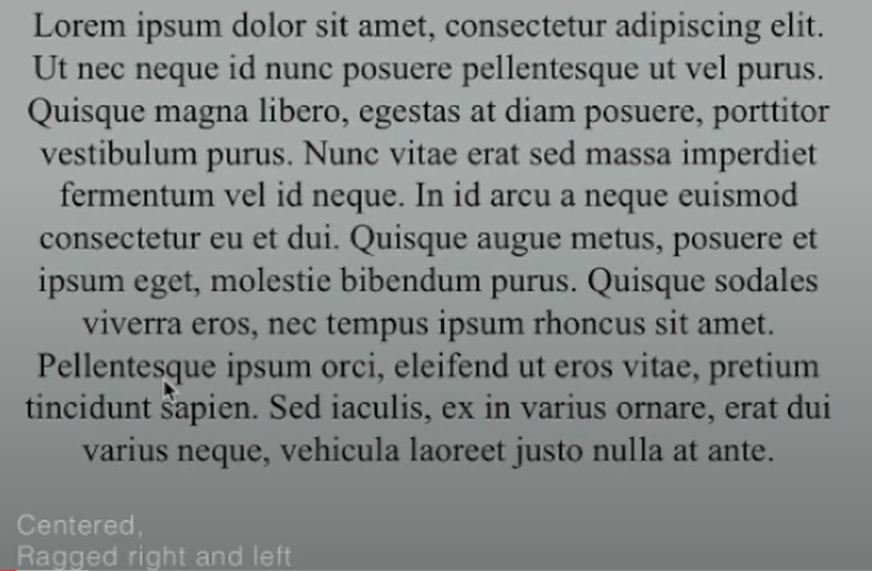
Centered is the format that enforces symmetry on the written content, treating both ends of each line with the same importance and emphasis. This approach turns the text into shapes, lending a visual element to a typically non-pictorial material. Given the powerful visual impact of centered type, it's crucial to adjust line breaks to ensure that the text appears smooth and not excessively uneven.
|
| Figure 3.2.2 Centered. |
In the Flush right format, the emphasis is placed on the conclusion of a line, rather than its beginning. This can be advantageous in contexts, such as captions, where the connection between text and image may lack clarity without a distinct right-hand alignment.

|
| Figure 3.2.3 Flush right. |
Justified is similar to centering, this format creates a symmetrical appearance for the text. This effect is accomplished by adjusting the spaces between words and, on occasion, even between letters. The resulting openness of lines can occasionally produce rivers of white space running vertically through the text. To address this issue, it is essential to pay close attention to line breaks and hyphenation, making necessary adjustments whenever feasible.

|
| Figure 3.2.4 Justified. |
3. Texture :
X-height is larger in proportion ascender
and descender will increase the readability.

|
| Figure 3.3.1 Anatomy of a typeface. |
4. Leading and Line Length :
Type size: Text type should
be large enough to be read easily at arms length.
Leading: Text
that is set too tightly encourages vertical eve movement; a reader
can easily loose his or her place. Type that is set too loosely
creates striped patterns that distract the reader from the material
at hand.
Line Length: Shorter lines require less leading;
longer lines more. A good rule of thumb is to keep line length
between 55-65 characters. Extremely long or short lines lengths
impairs reading.

|
| Figure 3.4.1 Bad leading. |

|
| Figure 3.4.2 Different leading. |
A type specimen book is to provide an accurate reference for type, type size, type leading, type line length etc. Without printed pages showing samples of typefaces at different sizes, no one can make a reasonable choice of type. You only determine choice on screen when its final version is to read on screen.

|
| Figure 3.5.1 Type specimen sheet. |
1. Indicating Paragraphs :
Pilcrow ¶: A holdover from medieval manuscripts seldom use today.
Paragraph space: If the line space is 12pt, then the paragraph space is 12pt. This ensures cross-alignment across columns of text.

|
| Figure 4.1.1 Cross-alignment. |
Cross-alignment: Cross-aligning headlines and captions with text type reinforces the architectural sense of the page-the structure-while articulating the complimentary vertical rhythms.

|
| Figure 4.1.2 Cross-alignment. |

|
| Figure 4.1.3 Line spacing vs Leading |

|
| Figure 4.1.4 Standard indentation. |
Extended paragraph: Creates unusually wide columns of text. Despite these problems, there can be strong compositional or functional reasons for choosing it.

|
| Figure 4.1.5 Extended paragraph. |
2. Widow or Orphans :
Widow: A short line of type left
alone at the end of a column of text.
Orphans: A short line of
type left alone at the start of new column.
To avoid widows and
orphans use Kerning (max +/- 3) or Force line break (Shift + Enter).

|
| Figure 4.2.1 Widow and orphans. |
3. Highlighting text :
Using Italic / Increasing the
boldness or weight of the text / Changing the type family and making
it bold / Change the color of the text / Placing a field of color at
the back of the text.

|
| Figure 4.3.1 Highlighting text. |

|
| Figure 4.3.2 Highlighting text. |
When highlighting text by placing a field of color at the back of the text, maintaining the left reading axis (right example) of the text ensures readability is at its best.

|
| Figure 4.3.3 Highlighting text. |
Sometimes it is necessary to place certain typographic elements outside the left margin of a column of type (extending as opposed to indenting) to maintain a strong reading axis

|
| Figure 4.3.4 Typographic elements. |
Quotation marks, like bullets, can create a clear indent, breaking the left reading axis. Compare the indented quote at the top with the extended quote at the bottom.

|
| Figure 4.3.5 Quotation mark. |
4. Headline within text.
'A' head indicates a clear
break between the topics within a section. In the following examples
'A' heads are set larger than the text, in small caps and in bold.
The fourth example shows an 'A' head 'extended' to the left of the
text.

|
| Figure 4.4.1 'A' head. |
The 'B' head here is subordinate to 'A' heads. 'B' heads indicate a new supporting argument or example for the topic at hand. As such they should not interrupt the text as strongly as 'A' heads do. Here the 'B' heads are shown in small caps. italic, bold serif, and bold san serif.

|
| Figure 4.4.1 'B' head. |

|
| Figure 4.4.2 'C' head. |
Week 4 / Principles of
typography.
In the fourth week's class, Mr. Vinod corrected our mistakes
in listing feedback using the Google feedback sheet. He then
proceeded to review our animated type expression works and provided
us with valuable feedback on how to enhance our work. Some of us
were asked to change our designs as they failed to convey the
meaning of the words effectively. After providing feedback on the
animation work, Mr. Vinod checked our e-portfolio progress and urged
us to watch the lecture playlist and do further reading, which we
were required to document in our blog. Moving on, he briefed us on
the upcoming exercise, which focused on text formatting. He
explained the exercise details and its requirements and showed us
how to obtain the text content for the task. Additionally, he
provided two lecture videos that we needed to watch before starting
the exercise.
Typo_5_Understanding
1. Understanding letter :
Although the uppercase letter forms below appear symmetrical,
they are actually not. The stroke weight of the Baskerville stroke
form (shown below) varies in two distinct ways, but what is even
more remarkable is that each bracket connecting the serif to the
stem has a distinctive arc.

|
| Figure 5.1.1 Understanding letter. |
The width of the left slope is thinner than the right stroke. Both Baskerville (previous) and Univers (below) demonstrate the meticulous care a type designer takes to create letterforms that are both internally harmonious and individually expressive.

|
|
Figure 5.1.2 Understanding letter. |
By closely analyzing the lowercase 'a' in two comparable sans-serif typefaces, Helvetica and Univers, we can clearly observe the intricate design of each letterform. A comparison of the finishing of the stems and the connection between the bowls and stems exposes a noticeable contrast in the distinctiveness of their characters.

|
|
Figure 5.1.3 Understanding letter. |
2. Maintaining x-height :
X-height is typically used to
indicate the size of lowercase letterforms. Nevertheless, it is
important to note that curved strokes, such as those in the letter
's', must extend beyond the median line (or dip below the baseline)
to give the impression of being of the same size as the adjacent
vertical and horizontal strokes.

|
| Figure 5.3.1 maintaining x-height. |

|
|
Figure 5.2.2 Median and baseline. |
3. Form / Counterform :
The term counterform (or
counter) refers to the space enclosed by the strokes of a
letterform. When letters are combined to form words, the counterform
includes the gaps between them. The skillful handling of
counterforms is key to ensuring clear and legible typography.

|
| Figure 5.3.1 Counterform. |

|
| Figure 5.3.2 Counterform. |
Contrast, the most impactful element in design, can be applied to type in a variety of ways, as demonstrated by Rudi Ruegg's framework. For instance, basic contrasts can create a range of effects, such as small+organic/large+machined or small+dark/large+light.

|
| Figure 5.4.1 Contrast. |

|
| Figure 5.4.2 Contrast. |
Week 5 / Typography in different
mediums.
During the week 5 class, Mr. Vinod asked us about our
hometowns and educational backgrounds before moving on to the
feedback session. Next, He reviewed our text formatting exercise and
offered suggestions for improvement. We also discussed the deadline
for Task 1: Exercises and received a briefing on Task 2: Typographic
Exploration & Communication. Mr. Vinod shared examples of
previous student work to guide us.
Typo_6_Screen&Print
1. Typography in different medium :
Print type vs Screen type.
Initially, typefaces were
created with print in mind, long before screen reading became
prevalent. The designer's responsibility is to guarantee that the
text is easy to read, flows well, and is pleasing to the eye. For
print, the most popular typefaces include Caslon, Garamond, and
Baskerville, among others. These typefaces are frequently chosen
because of their characteristic which are elegant and intellectual
but also highly readable when set at small font size.

|
| Figure 6.1.1 Print type. |

|
|
Figure 6.1.2 Print type. |
Fonts designed for web usage undergo optimization and modification
to improve their legibility and performance on digital platforms.
This could entail increasing the x-height (while reducing ascenders
and descenders), widening letterforms, opening up counters, using
thicker thin strokes and serifs, decreasing stroke contrast, and
altering curves and angles for specific designs.

|
| Figure 6.1.3 Screen type. |
In addition, typefaces designed for smaller sizes may require more generous spacing between characters to enhance readability. Taken together, these adjustments work to improve character recognition and overall legibility in non-print mediums such as the web, e-books, e-readers, and mobile devices.
2. Hyperactive link / Hyperlink :
Hyperlinks are
clickable elements such as words, phrases, or images that redirect
you to a different document or section within the current document.
They are commonly used in web pages, allowing users to navigate from
one page to another. Typically, text hyperlinks appear blue and
underlined, and when you hover the mouse over a hyperlink, whether
it is text or an image, the cursor should change to a small hand
pointing at the link.
3. Font size for screen :
The size of 16-pixel text on a
screen is comparable to text printed in a book or magazine when
accounting for reading distance. Books are usually set at 10 points
for reading at a close distance of a few inches. 16 pixels on most
screens are equivalent to 12 points, which is ideal for arm's length
reading.
4. System font for screen / Web safe font :
Different
devices have their own set of pre-installed fonts, which are mostly
based on the operating system they use. This results in slight
differences in the fonts available on different devices.
Windows-based devices might have one group. While MacOS ones pull
from another. Then Google's own Android system uses their own as
well.
However, there are some fonts known as "web safe" fonts
that are available on all operating systems, including Windows,
MacOS, and Google. For example, Open Sans, Lato, Arial, Helvetica,
Times New Roman, Times, Courier New, Courier, Verdana, Georgia,
Palatino and Garamond.
5. Pixel Differential Between Devices :
The text you see
on screens of different devices, such as PCs, tablets, phones, and
TVs, differs not only in size but also in proportion due to varying
pixel sizes. Even within a device class, there can be a lot of
variation.

|
| Figure 6.2.1 Variation in pixel and screen size. |
6. Static vs Motion :
Static typography has minimal
characteristic in expressing words. Traditional characteristics such
as bold and italic offer only a fraction of the expressive potential
of dynamic properties. Various forms of static typography are used
for different purposes, such as billboards, posters, magazines, and
flyers.

|
| Figure 6.3.1 Static typography. |
Woolman and Bellantoni (1999) suggest that Motion Typography in Temporal media provides typographers with a chance to add a sense of drama to their work, enabling letterforms to appear more dynamic and flexible. In film title credits, typography is frequently animated over time, bringing it to life and making it engaging.
Figure 6.3.2 Motion typography. (credits: YouTube)
Type is frequently used in music videos and ads, often animated in sync with the soundtrack. On-screen typography has evolved to become a more expressive element, capable of conveying the tone of the content or expressing a brand's values. Typography in title sequences is essential in establishing a mood for the film and priming the audience for what's to come.
Exercises: Type Expression
Our
first task requires us to choose four words from a list of seven
words and create type expressions for them. The list of words
includes 'rain', 'fire', 'crush', 'water', 'dissipate', 'freedom',
and 'sick'. Sketch out multiple ideas for each of the chosen
words, then select one idea for each word to finalize the design
work with 10 typefaces that are given.
Sketches

|
| Figure 7.1 Type expression sketches. (9.4.2023) |
Even though the task only called for four words with three ideas each, I decided to go above and beyond by providing five words with multiple ideas for each. Following the feedback session in week 02, I selected a few designs to digitize using Adobe Illustrator.


|
|
Figure 7.2, 7.3 & 7.4 Progress screenshot.
(15.4.2023) |

|
| Figure 7.5 Attempts at digitization. (15.4.2023) |

|
| Figure 7.6 Attempts at digitization. (15.4.2023) |

|
| Figure 7.7 Digitalized type expression. (15.4.2023) |
Final Type Expression

|
|
Figure 7.8 Final type expression. (20.4.2023) |
Type Expression Animation
During this period, we were
instructed to create an animation according to one of the type
expressions that we designed using Adobe Illustrator and Abode
Photoshop. Upon viewing Mr. Vinod's lecture playlist, I obtained a
fundamental understanding of how to generate a basic animation and I
decided to animate the word 'Rain'.


|
|
Figure 8.1, 8.2, 8.3 Progress screenshot. (22.4.2023) |
I decided to animate the word 'Rain' to descend like rainfall. The first few frames showed the raindrop started to fall and the letters enter the frame soon after.

|
| Figure 8.4 Progress screenshot. (23.4.2023) |

|
| Figure 8.5 Attempt at animation. (24.4.2023) |
After taking Mr. Vinod's insightful feedback, I made some improvements to my first attempt. I adjusted the speed of the raindrops, creating a more realistic effect by increasing the speed of those that are nearer and reducing it for those that are farther from the viewer (same as the word 'Rain'). I also adjusted the letters' animation track which allows the letters to fall completely and loop, resulting in a smooth and uninterrupted animation.
Final Type Expression Animation
.gif)
|
| Figure 8.6 Final type expression animation. (29.4.2023) |
For exercise 2, we need to watch lectures Text: P1 and Text: P2. These lectures will enhance our understanding of type choice, type size, leading, line-length, paragraph spacing, forced-line-break, alignment, kerning, widows and orphans and cross-alignment. Additionally, we will need to watch Formatting Text 1:4 to 4:4A and complete minor exercises to further develop our knowledge of information hierarchy and spatial arrangement, as well as our proficiency in using Adobe InDesign. Lastly, we will need to create a final layout design that's in A4 size.


|
| Figure 9.1, 9.2 & 9.3 Minor exercises. (30.4.2023) |
I did practice the skill of kerning and tracking using my name and 10 typefaces provided.
|
|
|
Figure 9.4 Kerning and tracking. (1.5.2023) |
The differences between the paragraphs before and after applying kerning.

|
| Figure 9.5 Before kerning. (1.5.2023) |

|
| Figure 9.6 After kerning. (1.5.2023) |
After the minor exercises above, I start to create my layout
design.
To create a clean and neat layout, I decided to use a
two-column format and left alignment for the body text.
Additionally, I utilized kerning and tracking to prevent the
occurrence of widows and orphans. For the imagery in my layout, I
selected a poster designed for the documentary film "Helvetica"
directed by Gary Hustwit.

|
|
|
Attempt 1 and 4
Fonts: Janson Text LT Std (75 Bold, 55
Roman & 56 Italic)
Point size: 10 pt, 30 pt & 72 pt
(heading) and 10 pt (body text)
Leading: 24 pt & 60
pt (heading) and 12pt (body text)
Paragraph spacing: 12
pt
Line length: 63
Alignment: Left align
Attempt 2 and 3
Fonts: Janson Text LT Std (75 Bold, 55
Roman & 56 Italic)
Point size: 10 pt, 18 pt & 48 pt
(heading) and 10 pt (body text)
Leading: 24 pt & 48
pt (heading) and 12pt (body text)
Paragraph spacing: 12
pt
Line length: 63
Alignment: Left align
Final Text Formatting
In the week 5 class, I presented my
text formatting attempts to Mr. Vinod and he provided me with some
feedback. Based on his feedback, I decided to make a few changes to
improve the overall layout. Firstly, I replaced the image that was
used in the layout because it was drawing too much attention away from
the text content. Additionally, I decreased the font size of the
headings to match the body text font size. To enhance readability, I
increased the leading between lines of text. Lastly, I reorganized the
paragraphs by adjusting the kerning and tracking to ensure that the
text was properly aligned and avoided bad rag.
Font: Janson Text LT Std (75 Bold, 55 Roman & 56 Italic)
Type Size: 36 pt, 24 pt & 10 pt
Leading: 39pt & 13 pt
Paragraph spacing: 0 pt
Body text
Font: Janson Text LT Std (55 Roman)
Type
Size: 10 pt
Leading: 13 pt
Paragraph spacing: 13 pt
Characters per line: 63
Alignment: Left justified
Columns:
2
Gutter: 5 mm
Margins: 12.7mm

|
| Figure 9.8 Final text formatting. (5.5.2023) |
Figure 9.9 Final text formatting PDF. (5.5.2023)

|
| Figure 9.10 Final text formatting - grid. (5.5.2023) |
Week 2
General Feedback: Try not using font for sketches. Avoid using graphical elements and do not distort the letter.
Specific Feedback: Reduce the graphical elements and avoid distorting the letter. Choose the best idea for each word from the sketches and work with the typefaces that are given to digitize it.
Week 3
General feedback: Update eportfolio regularly
and follow the structure that mentioned in the lecture playlist.
Do not distort the typefaces and use less graphical
elements. Do not use other fonts, only use the 10 fonts that are
provided.
Specific feedback: Watch the lecture
playlist and do further reading. Update the eportfolio. Avoid the
spacing between sentences by using Shift+Enter. Make the letter
bigger to fill the space that is given. Reduce the elements so
that not too much focus on the word. Redo the word 'water' and
'dissipate', it doesn't bring the meaning of the word.
Week 4
General feedback: It would be best to
pause at the end for a few seconds for some design.
Specific feedback: Let the words go down completely and loop, don't pause at the end
like the rain keeps coming. Make the raindrop and words fall at a
different speed. The rain that is closer will fall faster and
further fall slower.
Week 5
General feedback: If using justified
should increase the space between columns to 7mm. Suggest using a
sans-serif typeface. Use an image that is related to the articles.
Turn on the hyphenation for the paragraph that is uneven. It is
not suggested to use a condensed typeface as it increases the
difficulty of reading.
Specific feedback: Remove the
image at the right bottom corner as two images will make the
viewer hard to focus on the paragraph. The font size of
'Helvetica' should decrease to match the font size of 'I am'. The
leading (+/-2/3) should increase as now look compressed. Rearrange
the paragraph and image to better use of the space. Paragraph 4
looks weird of the ragging.
REFLECTIONS
Experience
As a beginner in typography, I am
experiencing feelings of nervousness and anxiety due to my lack of
basic knowledge in this area. To acquire a basic understanding of
typography, I have been watching Mr. Vinod's recorded lecture
playlist and attempting to learn from it. Besides, the exercises
are somewhat challenging since I'm only able to use the 10
typefaces provided, limited to using fewer graphical
elements and without distorting the letters. These make me feel a
bit lost, as many of my ideas for the exercises are restricted by
these rules. Next, being a newcomer I spend a lot of time to
familiarize myself with the Adobe applications such as Adobe
Illustrator and Adobe InDesign. As of now, I feel that my
experience with typography is learning to work within these
limitations and rules while exploring creative ways to express my
ideas using words.
Observation
During these exercises, I realize that my
ideas and sketches tend to rely heavily on graphical elements to
express words. Besides, I observed that I need to do more research
to increase my understanding of typography which allows me to gain
more inspiration and ideas. Lastly, I understood the importance of
spending more time using Adobe applications, not only to become
more familiar with the application but also to memorize the
shortcut keys and features. Typography is more difficult than I
initially think as it requires a range of skills that need to be
learned and practiced in order to create designs that express
words perfectly.
Findings
I learned basic knowledge of typography,
including its history, and a deeper understanding of how to create
effective designs that accurately express words. Next, I found
that my personal aesthetic preferences must be balanced with
readability so that the viewer will be easier to read the text and
understand it. Lastly, I realized the importance of typography in
our daily life as it can be seen in various mediums. A
well-designed typography should be able to express the words
accurately and efficiently.
FURTHER READING
According to the few books provided by Mr.Vinod, I decided to do some further reading with Computer Typography Basics - I.d.e.a.s. This book intro me about typography. It describe the first goal of typography was readability. Regardless of how attractive a page layout may appear or how unique a font selection is, if the typography makes the reader hard to read.

|
| Figure 10.1 Computer Typography Basics - I.d.e.a.s. (2003) |
This book's first chapter introduced the various font categories, each font categories have its unique characteristics. Knowing the different font categories is helpful when selecting fonts for various situation.


Additionally, fonts come in different versions, such as plain, italic, and bold, while font families are fonts with the same design but different weights. Understanding the different parts of characters, like x-height, can make it easier to decide on the appropriate font and size. Furthermore, there are special styles that are suitable for particular situations.


Chapter two of this book taught me about font size. The physical size would be different based on the type of font used. The selection of font size depends on the selected font, the audience, and more. For body text, a font size of 9-12 points is recommended and the ideal number of characters in a column should be between 50 to 65.

|
| Figure 11.1 Chapter 2: Font size, page 11. |
Chapter three of this book discusses character and word spacing. Kerning is used to enhance the visual appeal of text by adjusting the spacing between text. Tracking modifies the spacing between words to avoid widows and orphans.


Chapter four of this book provides an introduction to special glyphs, which refer to foreign characters and special symbols that are available on most computers.

|
| Figure 13.1 Chapter 4: Special glyphs, page 14. |
Chapter five of this book discusses line spacing, also known as leading. Line spacing refers to the amount of space between lines of text, which should be determined based on the chosen font, line length, and font size. The baseline grid is also important as it enables cross-aligns to be established across pages.


Comments
Post a Comment