LIEW XIAO HUI / 0353121 / BACHELOR OF DESIGN (HONOURS) IN CREATIVE MEDIA
TYPOGRAPHY
Task 3: Type Design & Communication
JUMPLINK
Lectures
Instructions
Task 3: Type Design & Communication
Feedback
Reflections
Further Reading
LECTURES
All lecture notes completed in
Task 1: Exercises.
Week 07 /
Mr. Vinod provide a briefing on the upcoming task
that we were required to complete. He also showed some examples of work by
senior students to give us a clear direction to follow. After that, we were
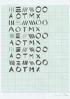
instructed to use the five tools with different nibs that we had prepared to
write diagonal, horizontal, vertical, circular lines and the letters AOTMX on
graph paper. This exercise was able to enhance our understanding of fonts and
their structural elements.
Week 08 /
Week 8 is an independent
learning week, there were no scheduled classes during this time. We were
tasked with uploading the five different selected options of our writing onto
Facebook and seeking feedback from Mr. Vinod. Next, Mr. Vinod instructed
us to continue practicing the selected writing style to achieve consistency
and uniformity. Additionally, we were advised to watch the first video
tutorial in the playlist and await the following week to proceed with our
work.
Week 09/
In week 9, Mr. Vinod provided some feedback
and also emphasized the importance of not skipping any steps in the process.
He encouraged us to spend time exploring and practicing writing the
letterforms. Additionally, he guided and demonstrated to us the steps and
techniques for digitizing the letterforms, including the use of shape tools
and brush tools. Mr. Vinod also assigned us the task of deconstructing fonts
to enhance our understanding of their structure.
Week 10/
Mr.
Vinod reviewed the work we had posted in the Facebook comment section and
provided guidance on refining the letterforms. He emphasized the importance of
refining the letterforms rather than directly copying the shapes we initially
wrote. Mr. Vinod then gave us time to work on refining our letterforms
individually and he come over to one-on-one instruct and demonstrate to us.
Mr. Vinod also identified areas for improvement and pointed out specific
issues. As the next step, we were assigned to further develop our typefaces in
FontLab after completing the digitization process in Adobe Illustrator.
Week 11/
During week 11, our regular class feedback session,
Mr. Vinod reviewed our progress on digitizing the typeface. He provided us
with valuable feedback based on the work we had completed. After the review,
Mr. Vinod allowed time for us to refine and enhance our current work based on
the feedback received and he demonstrated the methods to improve our designs
during this period. Furthermore, he provided instructions on how to use
FontLab, urging us to watch video tutorials from the lecture playlist to
further our understanding of the software. Finally, Mr. Vinod discussed the
rules and guidelines for the next step, which designing the poster.
Week 12/
In week 12, Mr. Vinod announced that there would be no class in week 13
as he would be unavailable in Malaysia. Next, he proceeded to review our
poster designs that incorporated the typeface we created. During the review,
he provided valuable feedback and suggestions for improvement. Following the
feedback session, Mr. Vinod allowed us time to refine our posters based on his
suggestions and he can review the updated versions directly in class. He also
provided demonstrations and guidance to address any issues or improve our
designs. Lastly, Mr. Vinod specified the assignment's deadline and provided
clear instructions on submission guidelines.
INSTRUCTIONS
Task 3: Type Design & Communication
For task 3, my assignment was to develop a typeface. The letters I will be
working on are a e t k g r i y m p n ! # , . To begin the process with
sketches, explore different options. After that, proceed to digitize
them using software such as Adobe Illustrator and later FontLab. After
completing the typeface, the final step will be to create a basic A4 size
poster to showcase the created typeface.

|
| Figure 1.1 Anatomy of typography. |
In addition to my research, I watched some instructional videos from Grilli Type Foundry on Instagram. These videos helped me create symbols like periods and commas, and their Instagram page provided valuable guidelines and tips for creating different letters.

|
| Figure 1.2 Instructional videos. |
I prepared 5 tools with different nibs and use those tools to write in different ways. By utilizing these tools, I am able to experiment with various writing techniques, explore styles and understand font structure.

|
| Figure 2.1 Exercise in class. (16.5.2023) |
Following that, I chose one option from each of the five tools and use the selected style to write the letters "a e t k g r i y m p n" on one graph paper either using UPPERCASE or lowercase letters for the writing. The chosen style for standard fine is the fourth row, while calligraphy is the first row. The brush style is the third row, and the standard board is the fourth row. Finally, the round style is the first row.
Upon receiving feedback from Mr. Vinod regarding the choice of the final style option, I proceeded to practice my writing using the selected style, which is row 4 (standard board).

|
| Figure 2.9 Practice writing. (27.5.2023) |
Letter Deconstruct
In addition, Mr. Vinod recommended
deconstructing fonts that resemble the final style option. This allows
for a deeper understanding of font structure, which can guide us in the
creation of our own unique typeface.
Gill Sans Std Regular
Red Hat Display Regular (Fontshare)
Manrope Regular (Fontshare)
Digitalize
I pick the best one from each letter in the final
option practice sheet in order to digitalize it using Adobe
Illustrator. I defined the baseline and x-height guides at 500pt,
while the cap height was set at 700pt. Then, I inserted the scanned image
of each letter representing the selected style and aligned it accurately
with the previously set guides. After that, I utilize the shape tool in
Adobe Illustrator to trace and recreate letter shapes according to the
image.
I created two different styles of the letter 'G'. The left version was designed as it was better align with the overall theme of the typeface I created, while the right version was traced and recreated based on the image.

|
| Figure 4.4 Letter 'G'. (2.6.2023) |
I have successfully transformed the letter into a digital format, and below is a side-by-side comparison between the original lettering and the digitized letterforms.

|
| Figure 4.5 Comparison showcasing. (2.6.2023) |

|
|
|
After receiving Mr. Vinod's feedback during week 10, I did some changes on my first typeface outcome. Mr. Vinod pointed out the issue in the first and second 'G' that I created and provided a demonstration on how to create a more accurate letter 'G'. Following his guidance, I created two additional letters 'G' using the demonstrated method. As a result, I created the last version of the letter 'G' with an increased size for the fourth version 'G'.

|
| Figure 4.7 Transformation of letter 'G'. (9.6.2023) |
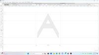
I also did improvement on the letter 'A' using the same stroke size as the other letterform.

|
|
|
|
|
| Figure 4.9 Progress screenshot. (9.6.2023) |

|
|
|
Final Digitalize Typeface Outcome

|
|
Figure 4.16 Final typeface. (13.6.2023) |
FontLab
After successfully digitizing my second attempt typeface
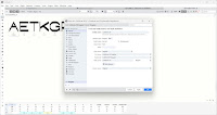
in Adobe Illustrator, I proceeded to develop and export it using FontLab7 by
following the video tutorials provided by Mr. Vinod in the lecture playlist.
I made necessary adjustments to the settings and transferred my typeface
from Adobe Illustrator to FontLab7. Next, I adjusted the positioning, left
and right bearing, and kerning to ensure balanced visual spacing within the
letterforms.
Figure 5.5 FontLab7 first attempt. (12.6.2023)
Due to the changes made in the second attempt at digitizing the typeface, I decided to start fresh by copying and pasting the final digitized typeface into FontLab.
Final FontLab7 Outcome
Font download: https://drive.google.com/file/d/1m9BIC7cjV7T0QgcQddmc1OeUq2t4WdHK/view?usp=sharing
Figure 5.10 FontLab7 final outcome. (17.6.2023)
Poster
After I finish creating a typeface with FontLab7, I
proceed to utilize the typeface I created to design a poster. I listed
down the available words using the letters 'A, E, T, K, G, R, I, Y, M, P,
and N', and then I combine them into a sentence following the guidelines
provided by Mr. Vinod. Using the sentence, I explore various compositions
for the poster design.

|
| Figure 6.1 List of words. (18.6.2023) |
Font: Cubiform XH Regular & Univers LT Std
Font size: 110pt &
12pt
Leading: 113pt & 14pt
Alignment: Left aligned

|
| Figure 6.3 Shortlisted poster 1. (18.6.2023) |
Font: Cubiform XH Regular & Univers LT Std
Font size: 110pt &
12pt
Leading: 113pt & 14pt
Alignment: Justified

|
| Figure 6.4 Shortlisted poster 2. (18.6.2023) |
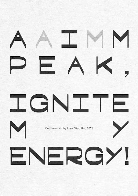
After receiving feedback from Mr. Vinod, I refined the selected poster design. I decided to go with the second shortlisted design but I replaced the word 'great' with 'peak' in order to utilize all the letters from my custom typeface. Additionally, I made adjustments by inserting the letters 'A' and 'M' within the gap of the word 'AIM' and fine-tuned the kerning of specific letters for optimal spacing and balance. Lastly, I followed Mr. Vinod's suggestion and added a paper texture to enhance the overall visual appeal of the poster.
Final Poster Design
Font: Cubiform XH Regular & Univers LT
Std
Font size: 110pt & 12pt
Leading: 113pt & 14pt
Alignment:
Justified

|
| Figure 6.7 Final poster. (23.6.2023) |
Final Task 3: Type Design & Communication
Font download: https://drive.google.com/file/d/1m9BIC7cjV7T0QgcQddmc1OeUq2t4WdHK/view?usp=sharing

|
|
|
Figure 7.2 Final type design PDF. (23.6.2023)

|
| Figure 7.3 FontLab screenshot. (23.6.2023) |

|
| Figure 7.4 Final A4 poster. (23.6.2023) |
Figure 7.5 Final A4 poster PDF. (23.6.2023)
Figure 7.6 Final font preview. (23.6.2023)
FEEDBACK
Week 8
General feedback: Make sure the letters are
positioned correctly. Practice writing in the selected preference style a
few more.
Specific feedback: Choose either the 3rd or 4th
writing style and focus on practicing that style to identify the most
suitable letter for digitization later.
Week 9
General feedback: Practice writing the letter not
design the letter. Take the time to explore and improve, and avoid skipping
directly to the final option.
Specific feedback:
The letter 'P' in the first row and the ninth row, the letter 'N' in the
sixth row are better. Pick one from each letter in the final option practice
sheet.
Week 10
General feedback: Instead of directly copying and
pasting the final option writing, it is recommended to trace the shape and
refine the digitized typeface.
Specific feedback:
Ensure that all letterforms maintain consistent stroke weight and follow the
x-height and cap height. It's important to note that the letter 'G' should
have a rounder shape compared to the letter 'P', as the latter does not have
a straight stroke.
Week 11
General feedback: Size of hashtag (#) is
about the cap-height. Hashtag (#) will have some angle, might not be
straight. Exclamation mark (!) bottom section will be smaller than the top
to create a visual representation of impact.
Specific feedback: More study on hashtag, it bottom has more length. Letter 'A' go below the
baseline. One side of letter 'Y' can be thinner. Period (.), comma (,), and
exclamation mark (!) is wrong.
Week 12
General feedback: The sentence must include all
the created letters. If a black background is chosen for the poster, make
sure in 90% black.
Specific feedback: Enhance the poster
composition by adding the letters 'A' and 'M' between the gap of the word
'AIM' in grey color. Ensure that all the letters from the created typeface
are utilized. Can add paper texture to the poster design.
REFLECTIONS
Experience
Although this is the third task in this module,
designing and creating my own typeface is a bit challenging for me. Unlike
the previous tasks, this one required a different skill and approach.
However, Mr. Vinod started by assigning us exercises that practice writing
using various tools which helped us to deepen our understanding of the
fundamental structure of typefaces. In the journey of completing this task,
I faced various challenges, but the sense of accomplishment I experienced
upon completing the design and creation of my own typeface as it can be
utilized in real-life.
I observed that creating typefaces is not an easy task it required understanding of some principles and following specific rules to ensure that the typeface remains unified and harmonious. However, despite its complexity, typography has its own unique charm and offers an enjoyable experience. Through the process of making typefaces, you will discover the fun and fascination of typography.
Findings
Creating my own typeface is an enjoyable and fulfilling
experience. The formation typeface take shape step by step is very satisfying.
I also found that it's important to know the significance of achieving a
balance between aesthetics and practicality. To address this, typography
offers specific rules and guidelines to ensure harmonious and effective design
solutions. These rules serve as guidelines to create harmonious and effective
typographic designs.
FURTHER READING
I decided to continue study on the book, Computer Typography Basics - I.d.e.a.s.

|
|
Figure 8.1 Computer Typography Basics - I.d.e.a.s. (2003). |

|
| Figure 8.2 Chapter 9: Tabs, page 22 & 23. |
Chapter 10 discusses paragraph indents and their various uses. The most common type is the small indent at the start of each paragraph, which adds design elements. The first-line indent is measured from the left indent, even if it's set to one inch, the first-line indent reads as zero. Hanging indents or outdents can be created by combining the first-line indent and left-margin indents. The standard indent is usually equal to the type size. Additionally, paragraph indent settings include options for both left and right indents. Single-side indenting is often used for design effects.
In Chapter 11 of this book, the concept of widows and orphans is discussed. A widow refers to a single line of text located at the top of a page or column, isolated from the rest of its paragraph while an orphan is a single line of text found at the bottom of a page or column, disconnected from its paragraph.
Chapter 12 covers special formatting and the first section focuses on hyphens and dashes. Hyphens are used for word or number division and breaking words across lines. Headlines and subheads should never be hyphenated. Dashes come in two forms: en-dash and em-dash. En-dashes are slightly longer than hyphens and are used to separate ranges, such as dates and quantities. If you can substitute "to" or "through" for the dash, it's used correctly. Em-dashes replace commas for emphasis in a sentence or precede quote attributions. Consider consulting a style manual for further details.
|
|
| Figure 8.5 Chapter 12: Special formatting, page 26. |
The second section discusses line breaks. It's important for readability, especially in headlines and subheads. Most programs provide the option to insert line breaks, done by using a shift-return. This helps maintain the integrity of the paragraph. If standard returns are used, only the last line of the subhead will have the correct settings.

|
| Figure 8.6 Chapter 12: Special formatting, page 27. |


Comments
Post a Comment