
LIEW XIAO HUI / 0353121
BACHELOR OF DESIGN (HONOURS) IN CREATIVE MEDIA / EXPERIENTIAL DESIGN
Task 02: Project Proposal
JUMPLINK
Instructions
Week 06 - AR Buttons and Video Player
Task 02: Project Proposal
Feedback
Reflections
In this task, we are required to complete weekly tutorial and practical exercises, submit a short reflective report on our findings, and propose three potential ideas for our AR project.
Progress
Exercises
Week 06 - AR Buttons and Video Player
For this week’s online class, we learned how to place a plane on an image target and import a video into Unity so that the video plays on the plane when detected.


Figure 1.1, 1.2, 1.3 Progress screenshot.
To set the display resolution for mobile devices, we were shown how to access the Build Settings and select the target platform, such as Windows, Android, or iOS. Mr. Razif recommended setting this up right at the start before beginning any app development.


Figure 1.4, 1.5 Progress screenshot.
We also learned how to add a button to control video playback, allowing a single button to handle both the play and stop functions. This is useful for mobile apps, where screen space is limited, and buttons often need to perform multiple actions. We wrote a simple C# script to control the video, attached it to the plane, and learned to check for any errors in the Console panel. It was a good reminder to always be careful with typos or mistakes in the code.


Figure 1.6 - 1.13 Progress screenshot.
Lastly, we explored how to use Script Machine in Unity to assign controls to a cube object. Script Machine is a more beginner-friendly, visual way to handle interactions without coding, as it provides preset events and actions. It’s especially helpful for those who aren’t familiar with coding but still want to build interactive features in Unity.


Figure 1.14 - 1.18 Progress screenshot.
Figure 1.19 Outcome.
Project Proposal
As mentioned in Task 01, I decided to continue with Idea 03, an AR driving tutorial/road lesson application. With the basic concept in mind, I created a new document in Google Docs, using the same problem statement developed earlier before moving on to user personas.
I chose to start by building user personas because they help me better understand users' needs and allow me to improve the product concept, objectives, and features accordingly, ensuring a more user-centered design.
For the first user persona, my initial idea was to represent an SPM leaver learning to drive in preparation for his driving test. However, while developing his persona and considering his perspective, I realized this application might not be suitable for him. Since the app focuses on drivers who already have their licenses but struggle with handling unexpected situations on the road, it doesn’t align well with learner drivers who typically follow fixed routes and instructions in driving school. Therefore, I revised the user’s background and details, including his psychographics, scenarios, pain points, and needs to better fit the app’s purpose.


Figure 2.1, 2.2 Progress screenshot.
Besides new drivers, I also identified another group of potential users, people who haven’t driven in a long time and may feel anxious or lack confidence behind the wheel. While practicing on the road is essential for regaining driving skills, I believe this application could support them by helping them re-familiarize themselves with a driver’s perspective and practice handling common real-world scenarios, reducing stress and anxiety.


Figure 2.3, 2.4 Progress screenshot.
Lastly, while exploring user behaviors, I realized that driving styles and regulations vary between countries. For example, left-hand and right-hand driving systems. This gave me the idea to include foreign visitors to Malaysia as a third persona, as they may face challenges with left-hand driving and understanding road signs written only in Malay. This inspired the creation of the final user persona.


Figure 2.5, 2.6 Progress screenshot.
After creating the user personas, I gained a better understanding of their needs and pain points. Based on these personas, I proceeded to create empathy maps by gathering and organizing all relevant information from the personas into one visual layout. This helped me gain a clearer, more comprehensive view of the users and allowed me to plan solutions tailored to their needs.


Figure 2.7, 2.8 Progress screenshot.
Once the empathy maps were completed, I moved on to developing the current state user journey maps. At first, I struggled with this part because I realized local drivers and foreign visitors would have very different experiences, making it difficult to combine them into a single journey map. I also wasn’t sure how to properly define the stages for the journey maps, especially since feelings of anxiety and lack of confidence usually occur before even getting behind the wheel, and if it's only a mental issue, it can be tricky to identify relevant pain points and gain points for each stage.
In the end, I decided to separate the journey maps into two. One for local drivers, covering the stages from preparing to drive until reaching their destination and one for foreign visitors, starting from trip planning all the way to arriving in Malaysia.


Figure 3.1, 3.2 Progress screenshot.
While working through the user journey maps, I discovered additional potential pain points by viewing the process in more detail and from the users’ perspectives. This allowed me to propose suitable solutions for each stage, listing possible features to develop within the application. Initially, I was unsure whether the solutions needed to be limited to app-based ideas or if they could include other services too. After a consultation with Mr. Razif, I confirmed that the solutions should be app-based only, as our focus is on creating an AR application.


Figure 3.3, 3.4 Progress screenshot.
Finally, I created a future state user journey map, based on the proposed solutions, to visualize the ideal experience and potential gains for users after those solutions are implemented.

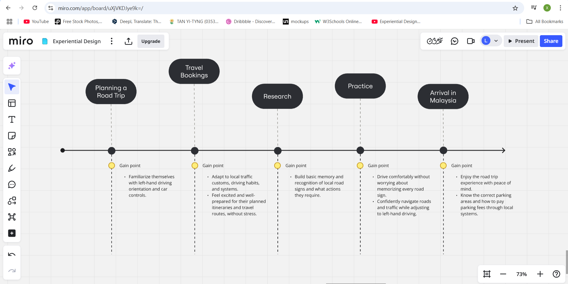
Figure 3.5, 3.6 Progress screenshot.
After completing the user journey maps, I revisited and refined the project objectives, product/services, and target audience. At this stage, I felt I had a clearer direction and more specific goals for the project, as well as a better understanding of the services the application should offer to address users' problems effectively.


Figure 4.1, 4.2 Progress screenshot.
 |
| Figure 5.0 Progress screenshot. |
Next, I started researching color palettes and typography for the project. I looked into color meanings to ensure the chosen colors would suit the vibe and purpose of the AR application.


Figure 5.1, 5.2 Research.
I discovered that blue is an ideal primary color as it represents technology and trust, aligning well with the concept of an AR driving assistant. For the secondary color, I was torn between yellow and green, concerned about achieving a good color balance. I decided to postpone the final color selection and planned to refine it later during the mockup stage.


Figure 6.1, 6.2, 6.3 Shortlisted color.
In Week 6, I booked a consultation session with Mr. Razif to ensure I was on the right track and to gather feedback.
 |
| Figure 7.1 Online consultation. |
Following his suggestions, I proceeded with creating a wireflow. A combination of wireframes and user flow in order to clearly illustrate how users would navigate through the app, including the clickable areas and navigation points.


Figure 8.1 - 8.7 Progress screenshot.
After completing the wireflow, I started designing the app mockups. The home page for the DriveSim feature was particularly challenging. Initially, I planned to display a 3D car model with explanatory text, but I realized it didn’t effectively represent the simulation of real-world driving scenarios. I then sought help from AI tools like ChatGPT and Gemini to generate images of a car interior from a driver’s perspective on Malaysian streets.

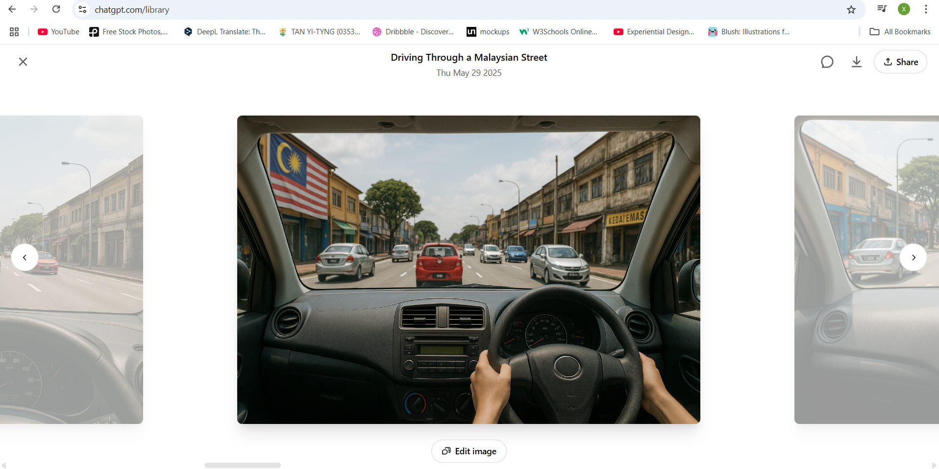
Figure 9.1, 9.2 Progress screenshot.
However, the results weren’t satisfactory. Eventually, I decided to simplify the car interior layout and make the steering wheel stand out with a 3D effect, while keeping the rest of the interior flat for clarity. Finding a suitable car interior image proved difficult as most available models were left-hand drive, which didn’t fit the Malaysian context. As a workaround, I horizontally flipped the images to suit my needs.


Figure 9.3, 9.4 Progress screenshot.
Although the result was acceptable, I was still concerned it might look too much like a racing game rather than an AR simulation.
 |
| Figure 9.5 Progress screenshot. |
To address this, I searched for additional references on Pinterest and came up with an idea to incorporate an AR scanning frame. To enhance the AR feel, I resized the frame, added gradient effects, and masked parts of the image to create depth, making the image center sharp and clear, while gradually fading the edges.


Figure 9.6, 9.7 Progress screenshot.
For the driving scenario selection section, my original idea was to use horizontal cards. However, arranging icons, colors, and descriptions in that layout felt awkward and didn’t match the app’s aesthetic. After observing trends on Pinterest, I noticed most modern apps maintain consistency in card shapes. So, I switched to vertical cards with icons on top and descriptions underneath, stacking them vertically. I also renamed the section from ‘Categories’ to ‘Driving Scenarios’ for better clarity.


Figure 9.8, 9.9, 9.10 Progress screenshot.
The most difficult part was finalizing the color combinations. I experimented with various color schemes and referred to existing designs to find a palette that best reflected the app’s personality while maintaining visual balance.


Figure 9.11 - 9.16 Progress screenshot.
After completing the home page, I moved on to the DriveSim interface. This was easier, as the colors were already defined and I only needed to find suitable images and arrange the scenario cards and buttons. Initially, my idea was to let users interact by clicking on parts of the car interior, like the signal switch or headlights. But I realized that, on a small screen, those areas would be too tiny and frustrating to tap accurately. So, I revised the interaction to use fixed action buttons instead.


Figure 10.1 - 10.6 Progress screenshot.
To display the correct steps after a user responds to a scenario, I planned to highlight the relevant car parts with a blue border and show each step beside it, one at a time. I edited the car interior images in Photoshop to add these blue outlines.


Figure 11.1 - 11.5 Progress screenshot.
Next, I designed the bottom navigation bar. Initially, I placed a circular indicator around the active icon, but it was too small and hard to notice against a white background. I then adjusted the design by attaching the navigation bar directly to the bottom of the screen, making it more prominent and improving usability.


Figure 12.1 - 12.4 Progress screenshot.
Once the MVP feature was completed, I developed the other two features, keeping their visual layouts consistent by displaying information cards and icons similarly.


Figure 13.1 - 13.5 Progress screenshot.
After wrapping up the screens, I returned to designing the app logo. I initially wanted to start with this earlier, but spent a long time searching for a suitable name and typography. My first idea was ‘VirtualWheel,’ which reflected the DriveSim feature but didn’t fit the other two functions. I eventually settled on ‘ARoad Guide’, a name that could be read as both ‘A Road Guide’ (representing the overall driving assistance from start to destination) and ‘AR Road Guide’ (highlighting the AR technology aspect).
For typography, I hoped to find a font related to roads or cars, but nothing met my expectations.


Figure 14.1, 14.2 Progress screenshot.


Figure 14.3 - 14.7 Progress screenshot.
Finally, I created the app’s welcome page, featuring the logo, a short tagline, and a yellow scanning frame to represent the AR element.
 |
| Figure 15.1 Progress screenshot. |
After completing the app mockup, I also took time to list down the driving scenarios that could be simulated based on the categories I had defined earlier.


Figure 16.1, 16.2 Progress screenshot.
I organized this content in Google Docs and then used it to create a presentation slide deck in Canva, shortening and refining some points to make them clearer and more suitable for my video presentation.


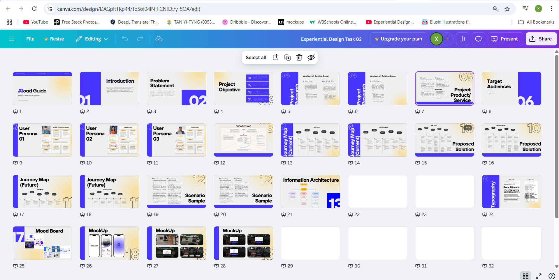
Figure 17.1, 17.2, 17.3 Progress screenshot.
Once the slides were ready, I recorded my video presentation using Zoom, where I explained the entire project process, the decisions I made along the way, and the final outcomes I produced.
Final Project Proposal
Project Proposal Document- Google Docs
Figure 18.1 Project proposal document - PDF.
Presentation Slides
Video Presentation
Figure 18.3 Video presentation.
Week 06
The focus for this project will be on developing features related specifically to the AR aspect of the application. While other ideas or supporting services can be explored conceptually, the project scope requires that the proposed solutions remain centered around the AR functionality.
If time is limited, the mockup design can concentrate on showcasing the AR simulation feature as the core of the application, while additional features such as ParkingHub are considered optional and can be omitted from this stage of development.
Several scenario ideas can be listed in the proposal.
REFLECTIONS
Through this project, I realized the importance of standing in the user’s perspective to truly understand their feelings, thoughts, and experiences. By doing so, it becomes much clearer to identify their pain points and gain points, which can be effectively captured using tools like user personas, empathy maps, and journey maps. This understanding is incredibly valuable when refining or improving a project idea, ensuring that the final product or service is genuinely helpful and relevant to the user’s needs. Without this process, a product risks being unappealing and left unused.
Additionally, I discovered that creating a detailed project proposal is time-consuming but essential. It requires not only an in-depth understanding and analysis of the current market and user behaviors but also careful definition of the project’s core personality and identifying its MVP (Minimum Viable Product). This foundation is crucial to keep the project focused and purposeful.
When it came to completing the application mockup, I found that the most challenging part for me was the application of colors and achieving balanced, visually appealing compositions. I noticed this is a personal weakness. I often admire how other designs look simple yet striking through clever and balanced use of color. However, when attempting to apply similar ideas to my own designs, the result doesn’t always look as good. I’ve learned that I need more practice in this area and plan to regularly observe and analyze well-designed work created by others to improve my sense of color usage and visual harmony.
Comments
Post a Comment